My default patterns for summer knitting are hats, almost always done in brioche style. They are small, easily portable, and do not add heat to my lap as I work on them.
Plus the brioche makes them reversible and double-layered so they are amazingly squishy and quite warm come the cold weather. I find it is easy to find very happy recipients once they are done!
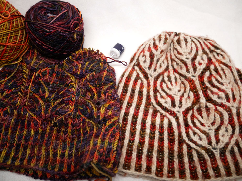
So for the last week or so I've been working on Katrin Schubert's Mood of March, , using some extra skeins Arroyo and Ella Rae that are almost the same as we have in our kit for Brioche Woodgrain Scarf .
I have been enjoying how the colors kind of play peek-a-boo just like sunlight through autumn leaves as the variegated colorways of the two yarns, while usually contrasting well, do on occasion "meet" in very similar hue.
Well, I happened to notice that I have another hat done in a very similar style, also brioche and also leaves, though I don't really recall the exact pattern. And for this one the two colors remain very strong contrast throughout. I took a photo to show the difference in the look in the finished piece.
Interesting, no? There is something I really like about both; quite different moods.


